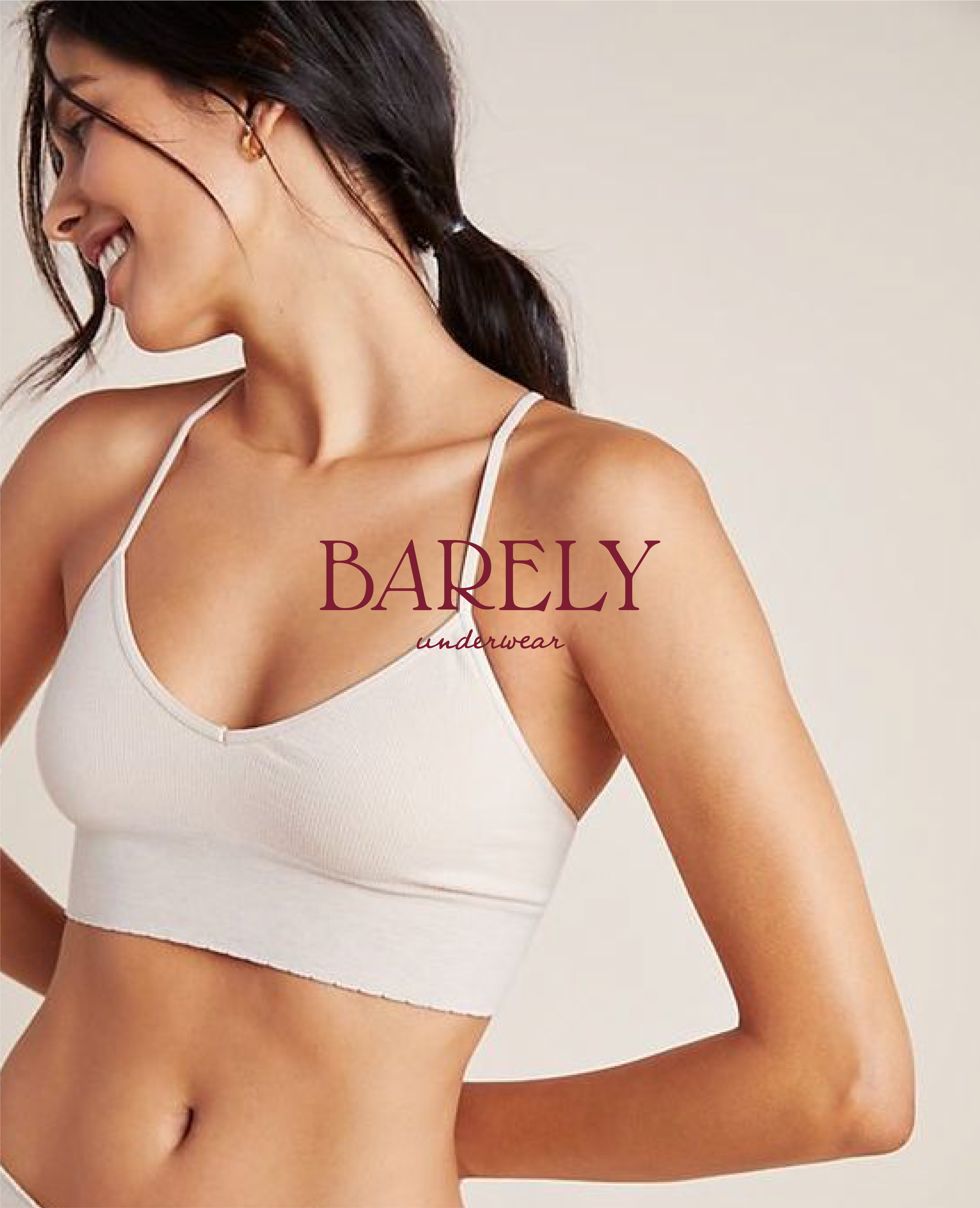
BARELY
brand identity / moodboard / print / packaging
BARELY is a brand empowering women by offering comfortable and sexy underwear that helps them feel beautiful inside and out. the brand is designing sustainable products, with respect for the planet, combining style, comfort, and environmental responsibility.
i develop the brand identity - website design and communication visuals.
The logo suite has been carefully designed to be authentic with a premium touch. The main logo, featuring a serif font, exudes sophistication while the handwritten font underneath adds a playful and approachable element.
The secondary logo removes the "underwear" inscription and instead uses the same handwritten font, adding a signature touch that reinforces the brand's identity.
The creative direction I chose for this project was soft and peaceful, yet vibrant.
To align with the women’s empowerment movement, I selected shades of pink, beige, and skin-like tones to reflect the brand's values of body positivity and sisterhood.
The thank you cards are all about sorority, sustainability and inclusivity.


